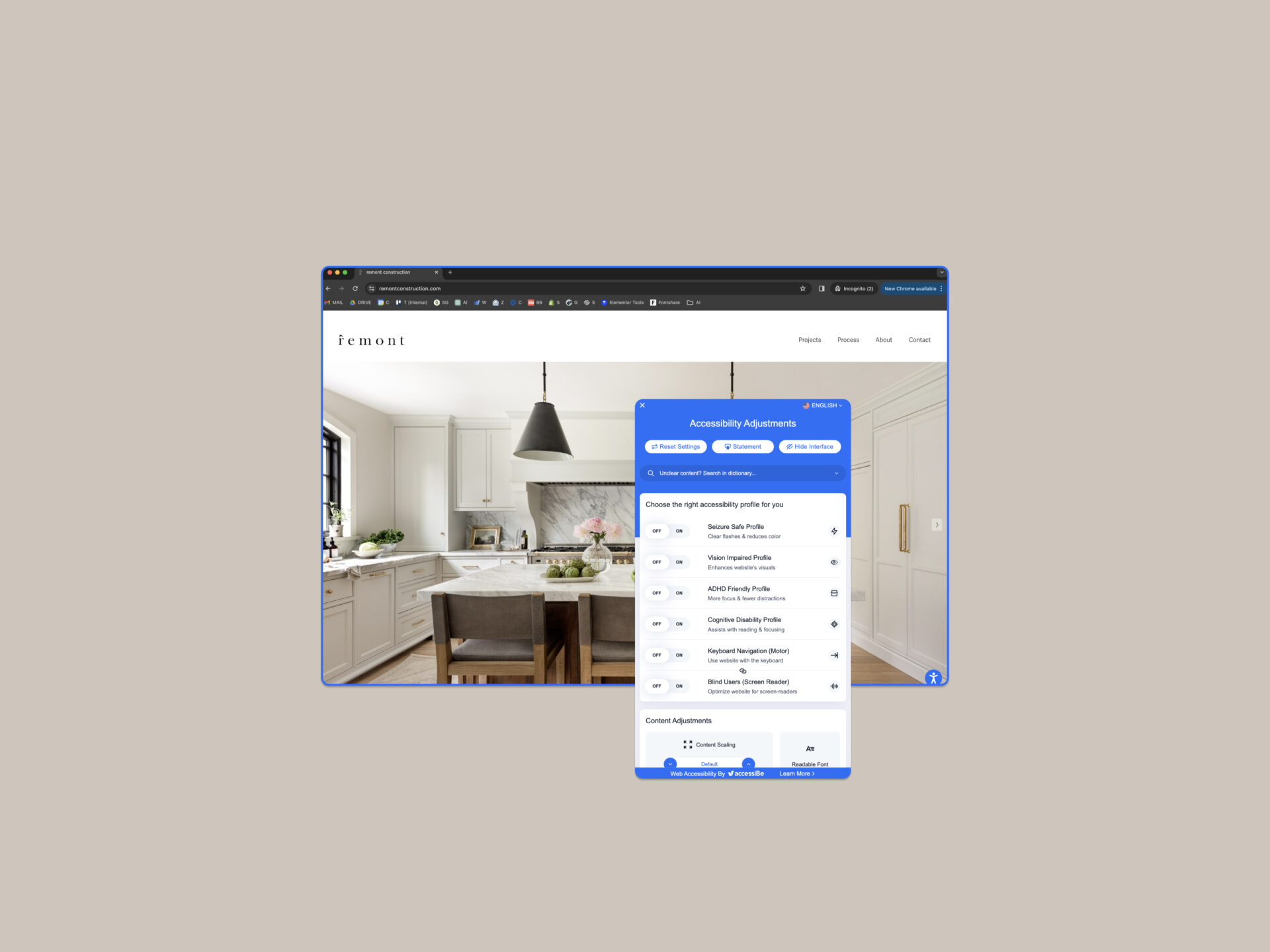
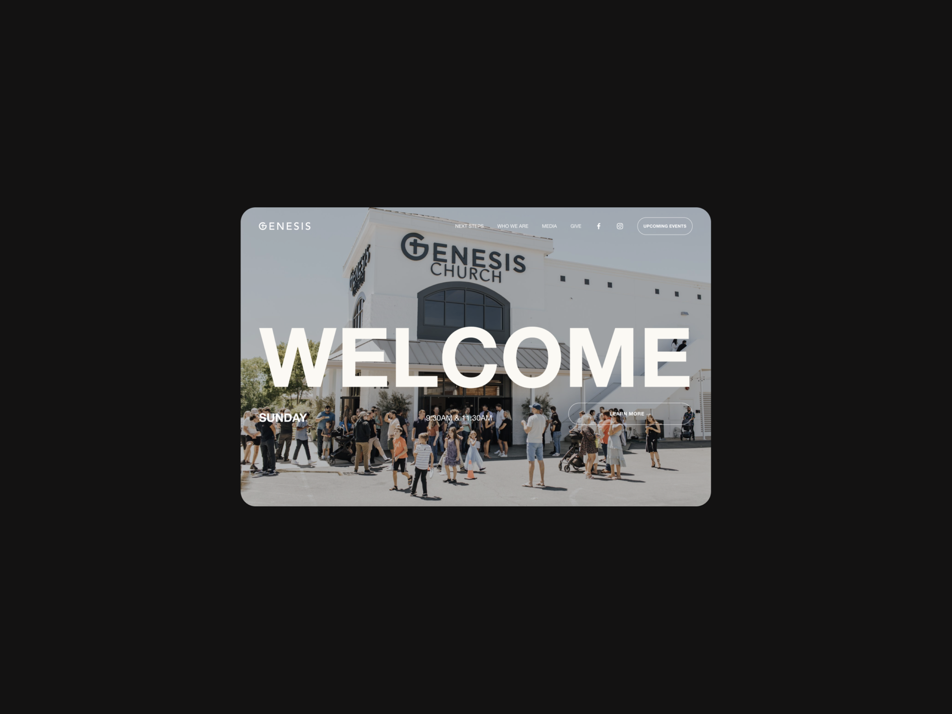
In the digital era, the psychology of design plays a pivotal role in how construction companies present themselves online. Understanding the intricate dance of color, grids, and user experience (UX) can transform a website from a mere digital presence into a powerful business tool. Let’s dive into these elements and explore their significance in the context of construction company websites.
Color: Building Emotional Connections
Strategic Color Selection: Colors evoke emotions and can significantly influence customer perception. For construction companies, colors like blue and gray symbolize reliability and professionalism, while green can reflect a commitment to sustainability. This alignment with brand identity design is crucial for creating an emotional resonance with the audience.
Consistency and Branding: Consistent use of color aids in building brand recognition. Whether it’s logo design and branding or website elements, uniformity in color use strengthens the brand’s identity, making it memorable in the competitive construction market.
Grids: The Blueprint of Your Website
Structured Layouts for Easy Navigation: Grids are to websites what blueprints are to buildings. They provide a structured layout, making the website navigable and user-friendly. A well-organized grid enhances the website’s readability, guiding the user through the site’s content effortlessly.
Responsive Design for All Devices: Construction companies must ensure their websites are accessible on all devices. Responsive grid designs adapt to different screen sizes, offering a seamless experience whether the user is on a desktop, tablet, or mobile phone.
UX: Building a User-Centric Online Environment
Intuitive Navigation: UX is all about how users interact with your website. For construction companies, it’s crucial to have a clear, intuitive navigation system. This ensures that potential clients can easily find information about services, past projects, and contact details.
Engaging and Informative Content: The content on a construction company’s website should be engaging and informative, highlighting their expertise in website development services. From showcasing past projects to detailing service offerings, the content should speak directly to the needs and interests of the target audience.
Calls to Action: Effective UX design includes strategically placed calls to action (CTAs). These prompts encourage users to take the next step, whether it’s inquiring about a project, scheduling a consultation, or requesting a quote.
Conclusion
In conclusion, the psychology of design in the context of construction companies is about creating a website that resonates emotionally through color, is navigable and responsive through effective grid use, and prioritizes user experience. Integrating these elements leads to a powerful online presence that not only showcases the company’s expertise but also builds trust with potential clients.
Elevate your construction company’s digital presence with Bozh Studio, a leading creative design agency. Our expertise in brand identity design and website development services will help you stand out in the digital landscape. Connect with us today, and let’s build your brand together!


