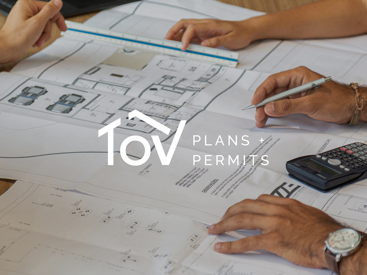
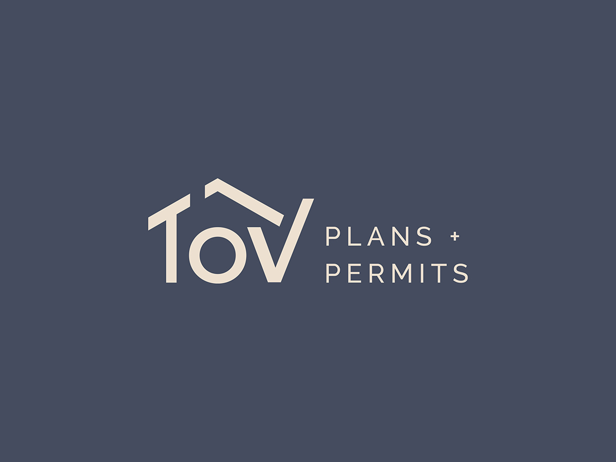
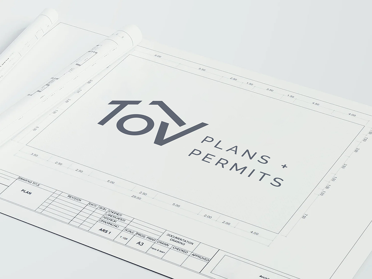
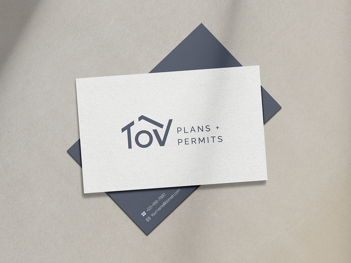
Bozh Studio partnered with TOV Plans + Permits to create a distinctive and meaningful brand mark that reflects their expertise in residential construction permitting. The challenge was to design a logo that communicates trust, structure, and precision.
The final logo is an abstract interpretation of the letters “TOV,” cleverly incorporating three core visual elements:
- A house shape, representing the residential focus of their work
- A blueprint-style structure, symbolizing planning and engineering
- A subtle check mark, reinforcing the idea of approval and reliability
The result is a clean, professional logo that speaks directly to TOV’s mission—bringing clarity and confidence to construction projects of every scale.
What we delivered
- Logo design
- An abstract “TOV” lettermark built from three ideas: the home, the plan and the approval
Our approach
TOV takes projects from the first drawings to final approval from the local jurisdiction, for homeowners, builders, contractors and property managers. The logo had to say that in one shape: a house for the homes they plan, blueprint lines for the drafting work, and a check mark for the approval at the end.
More on our work for builders, architects and permit professionals: website design for construction companies and logo and brand identity design